Challenge 1:
How can we design a compelling landing page that is both highly functional and accessible for new users?
Challenge 1:
How can we design a compelling landing page that is both highly functional and accessible for new users?
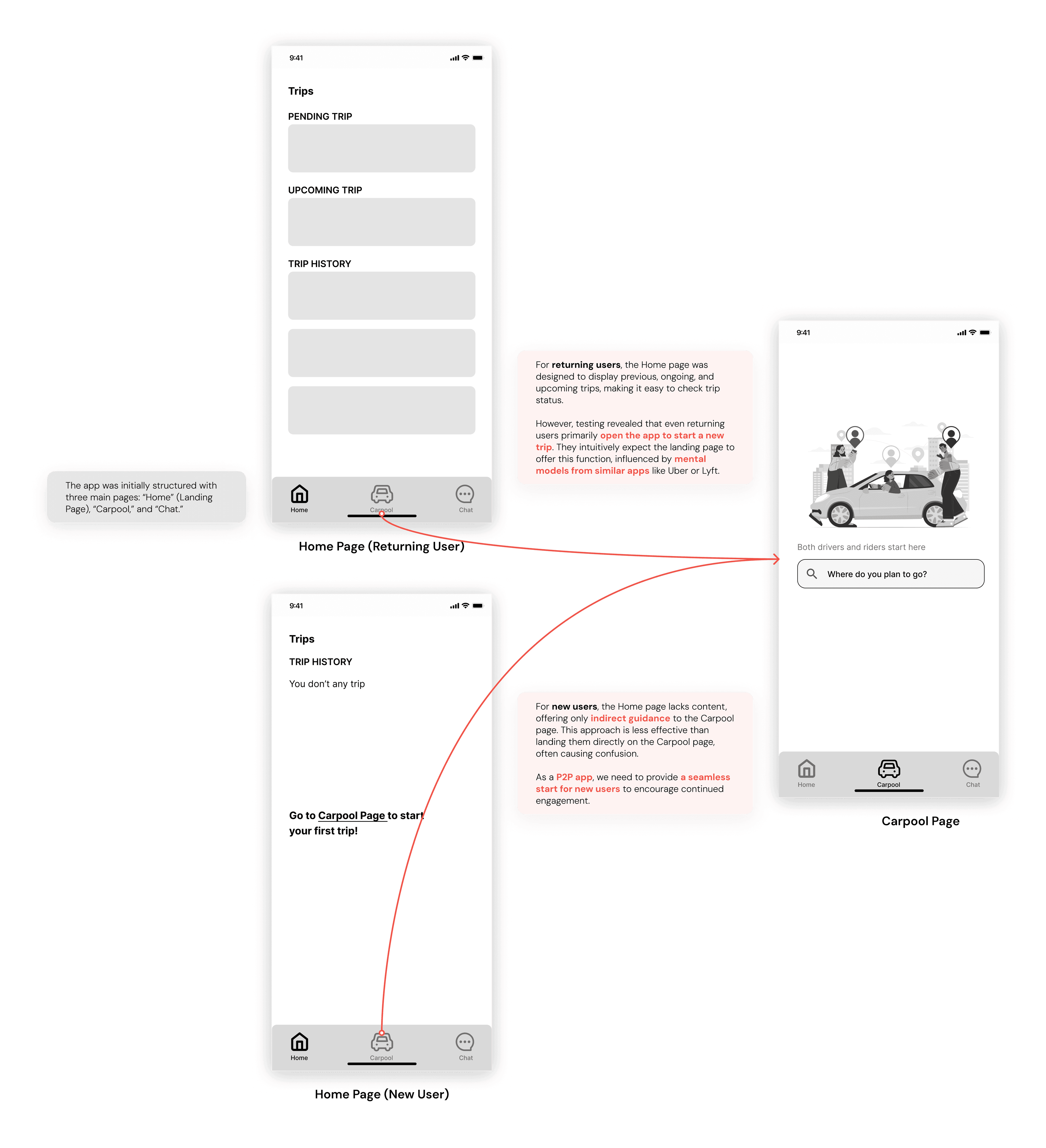
Initially, we envisioned our app with four main sections: Home, Carpooling, Explore, and Profile. The Home page displayed trip details, while the Carpooling page handled new carpools.
However, flowcharting and user testing revealed issues. Most primary flows began with searching for or starting a trip, making a separate Carpooling page redundant and adding unnecessary steps.
New users also found it difficult to locate the 'start a trip' function, highlighting a lack of intuitiveness in the design.
Initial Design of Main Page Structure and Landing Page
Initial Design of Main Page Structure and Landing Page
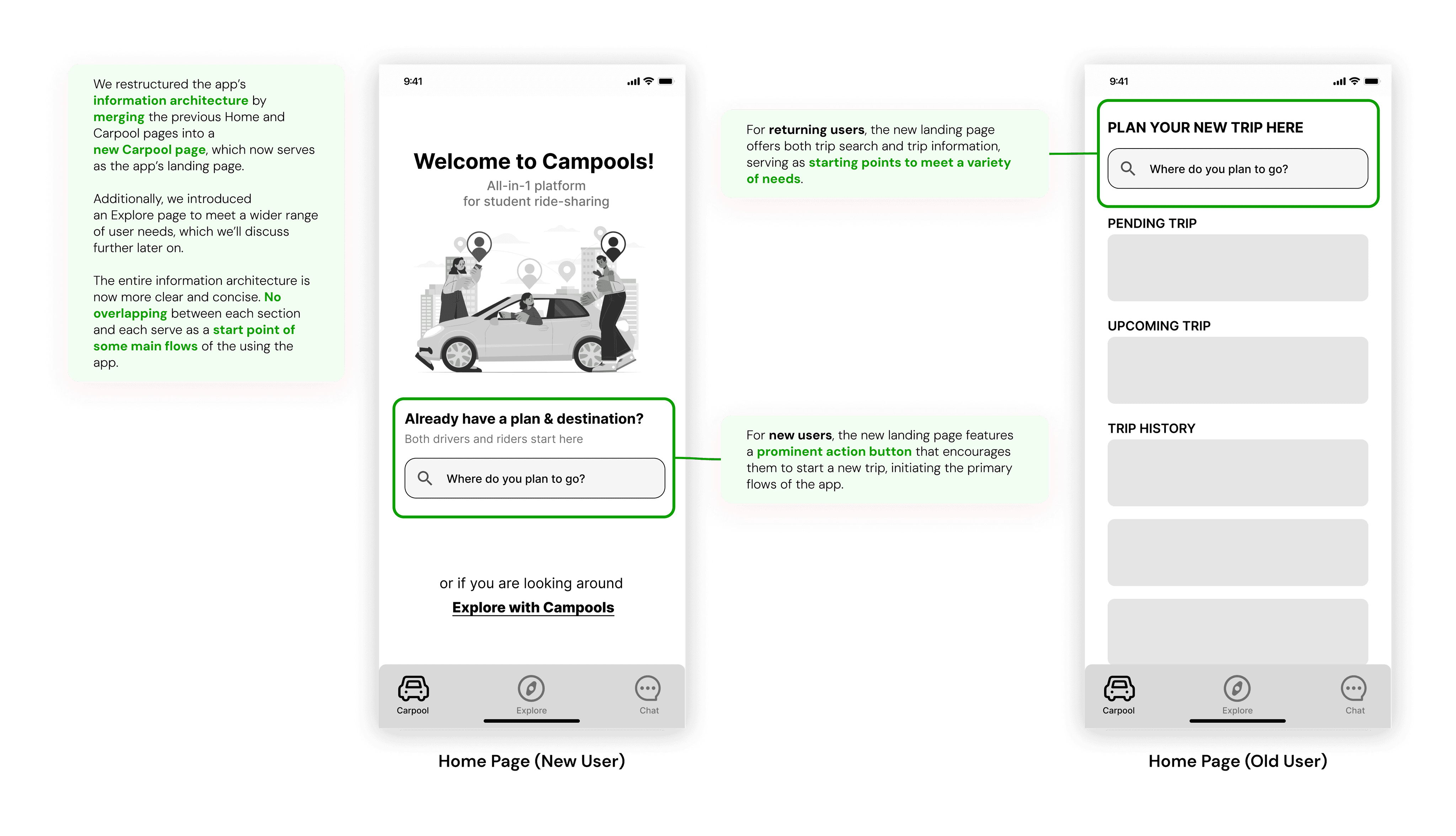
Considering all testing feedback, we decided to merge the Home Page and Carpool Page into a unified Home Page. The differences and benefits are outlined below:
After Design of Main Page Structure and Landing Page
After Design of Main Page Structure and Landing Page
Challenge 2:
How can we design a seamless flow for users switching between driver and rider roles while ensuring simplicity and flexibility?
Challenge 2:
How can we design a seamless flow for users switching between driver and rider roles while ensuring simplicity and flexibility?
Initially, we considered separating the flow for drivers and riders, similar to Uber’s approach of having different apps for each.
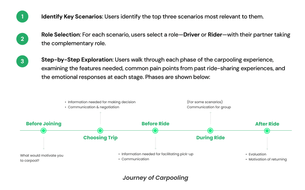
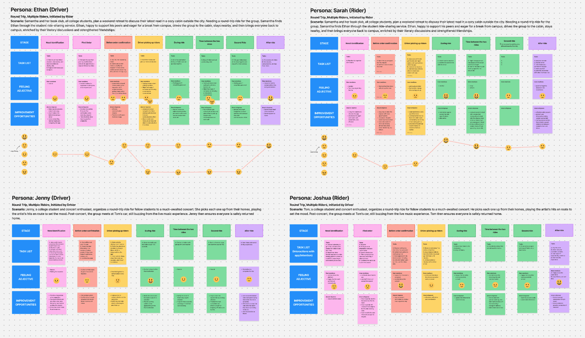
User interviews and testing showed that many users frequently switch between driver and rider roles. Car owners typically confirm their destination and time, check existing trips, and finally choose to drive or ride based on availability. This flexibility required a design that seamlessly supports both roles, adapting to users’ needs.
We simplified the flow by removing role-switching as a separate task, allowing users to select their role in the final step of 'choosing a trip.' This design offers flexibility for those who can be both drivers and riders, enabling seamless trip browsing. Filters ensure users with a single role can easily find relevant trips.
To ensure users can easily navigate this innovative ride-sharing flow, we also incorporated the following features:
Step-by-step input for location and time details
Clear display of previous inputs
Intuitive and concise interactions
Challenge 3:
How can we present key information in a concise and visually engaging way, ensuring clarity while avoiding cognitive overload?
Challenge 3:
How can we present key information in a concise and visually engaging way, ensuring clarity while avoiding cognitive overload?
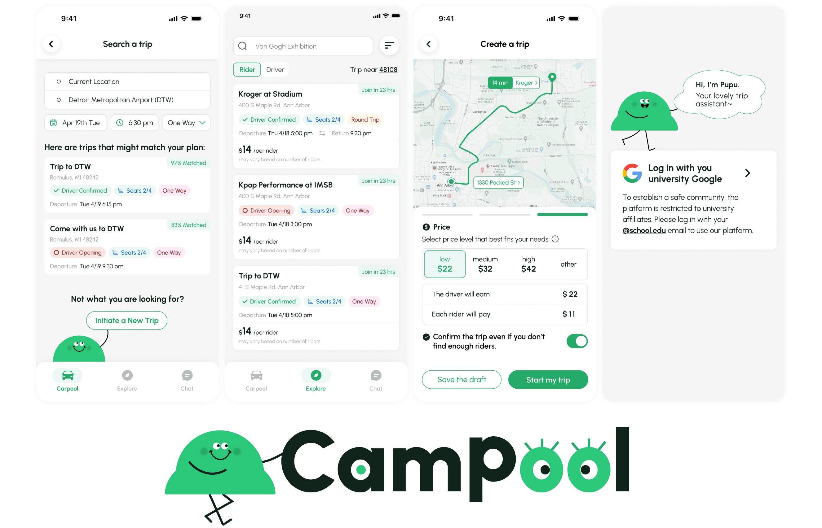
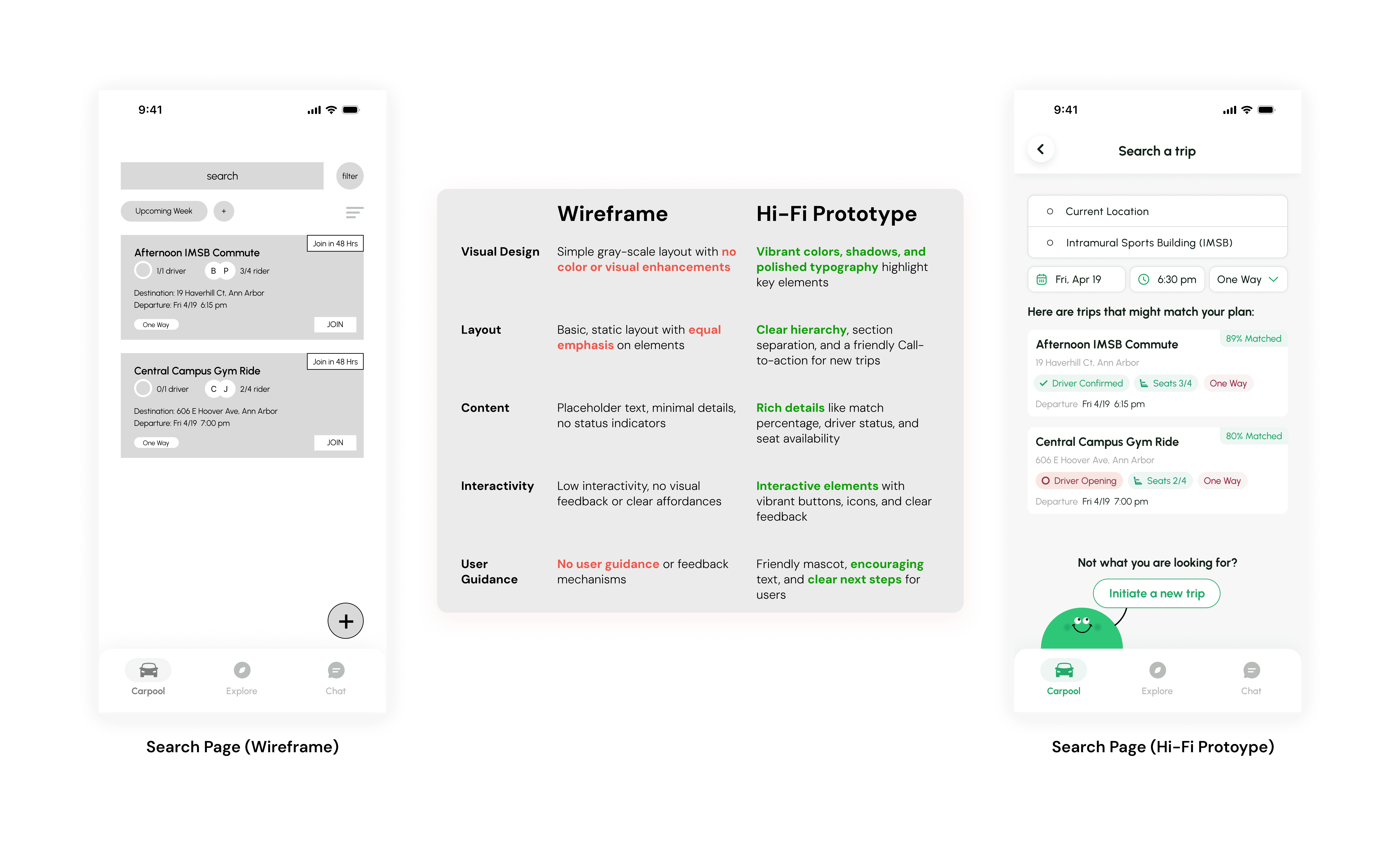
When designing the search page, users expressed a need for comprehensive trip information at a glance, but too much detail risked overwhelming them. This challenge required a thoughtful approach to balance detail and simplicity.
By reimagining the layout and visual hierarchy, I structured the final design to display key trip details clearly, using color-coded statuses, concise text, and interactive elements. This ensures users can quickly understand the information without feeling overloaded.
