Safelane: Safe Transfers for Seniors
Team Project | Fall 2022
Team Project
Fall 2022
Product Design | Figma
Product Design
Figma
My Role:
UX&UI Design (Primary Designer),
UX Research
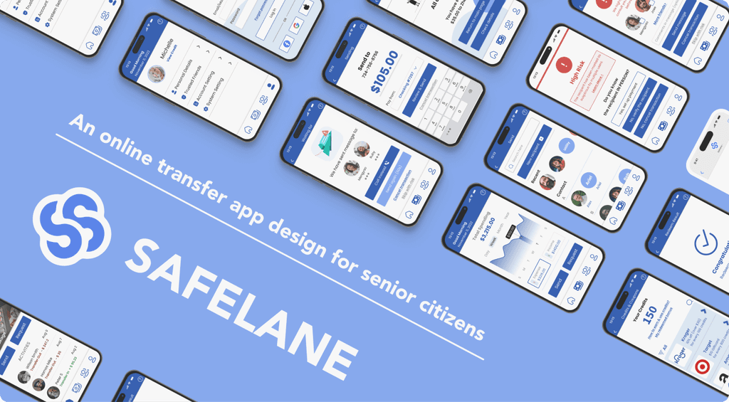
Financial scams targeting seniors surged to $1.7 billion in 2021, highlighting the need for better protection. SafeLane was created to address this issue by offering a user-friendly platform that educates and protects seniors from fraud.
Through user research and competitive analysis, SafeLane identified challenges like accessibility gaps and lack of community support. The platform features an intuitive interface with larger fonts, clear icons, and community forums to foster connections and collective awareness.
SafeLane empowers seniors with the tools and knowledge to navigate the digital world safely, protecting them from financial fraud.
Highlights
Highlights
Accessibility Matters
Our app is tailored for senior citizens, featuring larger fonts, buttons, and intuitive icons. To minimize confusion, we use a simplified color scheme to ensure ease of use for elderly users.
The Power of Connections
Based on our UX research, the app fosters meaningful connections among seniors through features like forums, trusted contact options, and coupons, enhancing social bonds.
Project Roadmap
Step 1: Problem & Solution Formulation
1.1 Challenge
1.1 Challenge
Many people have heard of the news of senior citizens being scammed. The fact becomes more clear when we look through the data in recent years. Senior citizens deserve more attention in the area of anti-scam.
$1.7B
$1.7B
$1.7B
Total Loss in 2021
Total Loss in 2021
Total Loss in 2021
92,371
92,371
92,371
Recorded Older Victims in 2021
74%
74%
74%
Increase in Losses Compared to 2020
1.2 Competitive Analysis
To know what has already existed and what can be improved in the area of anti-scam regarding senior citizens, we conducted a competitive analysis for direct, partial, or analogous competitors.
Partial Competitor: Chase
Pro
Pro
Secured and active system to prevent financial abuse
Easy access for users to functions such as reporting fraud or freezing account with multiple ways
Secured and active system to prevent financial abuse
Easy access for users to functions such as reporting fraud or freezing account with multiple ways
Con
Con
Interfaces are not designed for senior citizens with low learnability and memorability and sometimes get too complicated
Only prevent financial abuse conducted on Chase but not on other banks and, thus, cannot collect and integrate cross-platform financial abuse information
Interfaces are not designed for senior citizens with low learnability and memorability and sometimes get too complicated
Only prevent financial abuse conducted on Chase but not on other banks and, thus, cannot collect and integrate cross-platform financial abuse information
Analogous Competitor: FactStream
Pro
Pro
Senior-citizen-friendly interface and interaction design with high learnability and memorability
Interesting icons showing the validity score
Senior-citizen-friendly interface and interaction design with high learnability and memorability
Interesting icons showing the validity score
Con
Con
News is scored manually, which requires lots of work, limits the amount of content that can be searched within the app, and may cause subjectivity.
There is no user community built in the app, and users cannot even comment on the news
News is scored manually, which requires lots of work, limits the amount of content that can be searched within the app, and may cause subjectivity.
There is no user community built in the app, and users cannot even comment on the news
Direct Competitor: EverSafe
Pro
Pro
Specially designed interface and interaction for senior citizen
Provides ways for children to help their aged parents
Specially designed interface and interaction for senior citizen
Provides ways for children to help their aged parents
Con
Con
Expensive subscription fee with $11.99/month for senior citizen and $14.99/month for others
Potential private data leakage
Expensive subscription fee with $11.99/month for senior citizen and $14.99/month for others
Potential private data leakage
Analogous Competitor: National Anti-Scam Center App
Pro
Pro
The Chinese government-designed integrated platform collects nationwide scam data, enhancing fraud identification accuracy.
To educate citizens on avoiding financial abuse, the app employs humorous sitcoms, making anti-scam learning engaging.
The Chinese government-designed integrated platform collects nationwide scam data, enhancing fraud identification accuracy.
To educate citizens on avoiding financial abuse, the app employs humorous sitcoms, making anti-scam learning engaging.
Con
Con
Its inaccessibility for elderly or disabled users due to its complex design and multifunctional interface.
The app's supervision of user activities, including website visits and transactions, raises privacy concerns.
Its inaccessibility for elderly or disabled users due to its complex design and multifunctional interface.
The app's supervision of user activities, including website visits and transactions, raises privacy concerns.
What we learned
to guide us through the next steps...
Most of the apps are not user-friendly for the elderly. We need a more concise interface that is easy to operate for people not good at using mobile apps, as well as able to support multiple functions.
As the main function of such apps is to detect potential risks in the mobile, they sometimes may go beyond the privacy rules. It is necessary to think about solutions to implement accurate detection of financial abuses without violating the privacy of users.
Many of the competitors need high labor costs. We will think about how to reduce labor costs and improve quality by making workflows more efficient.
1.3 User Interview
1.3 User Interview
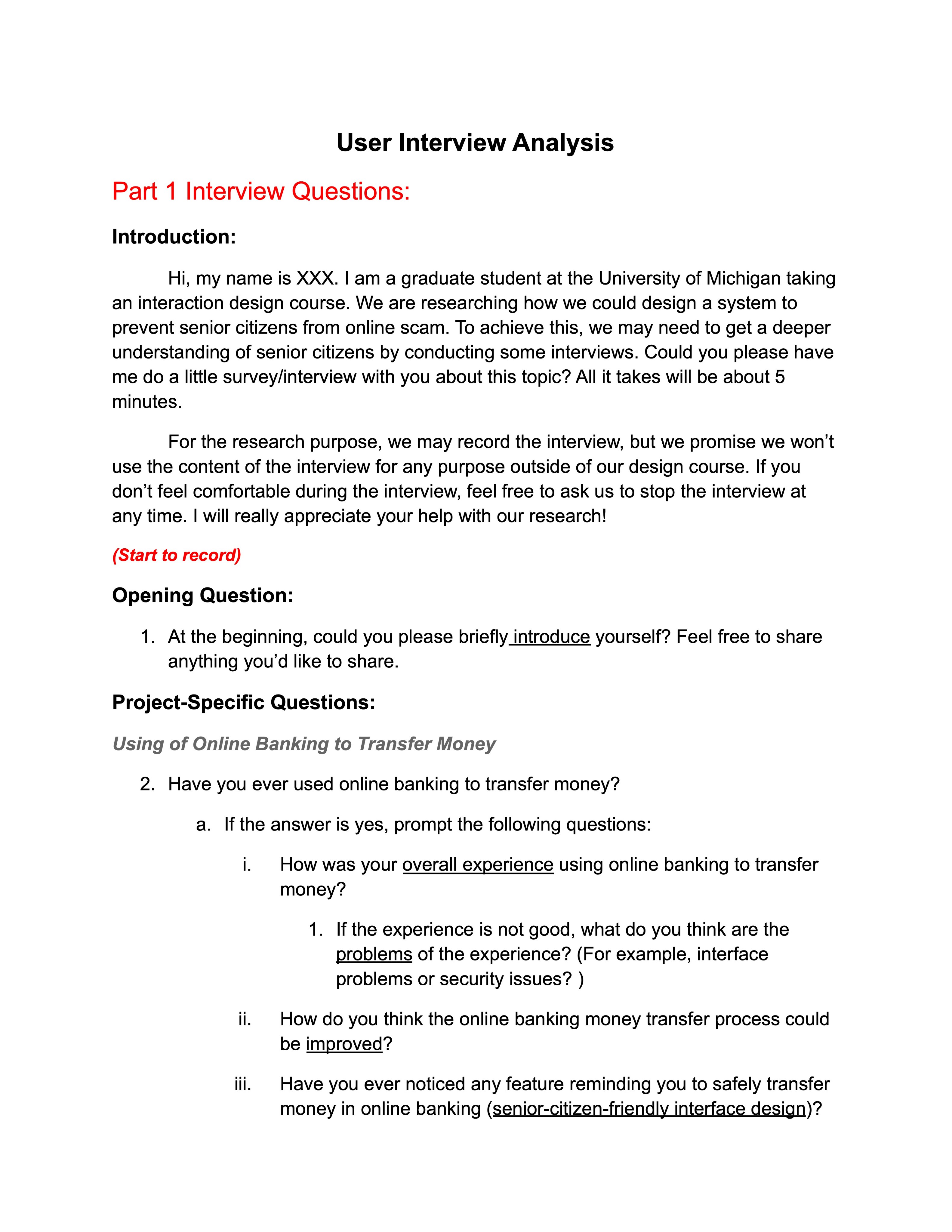
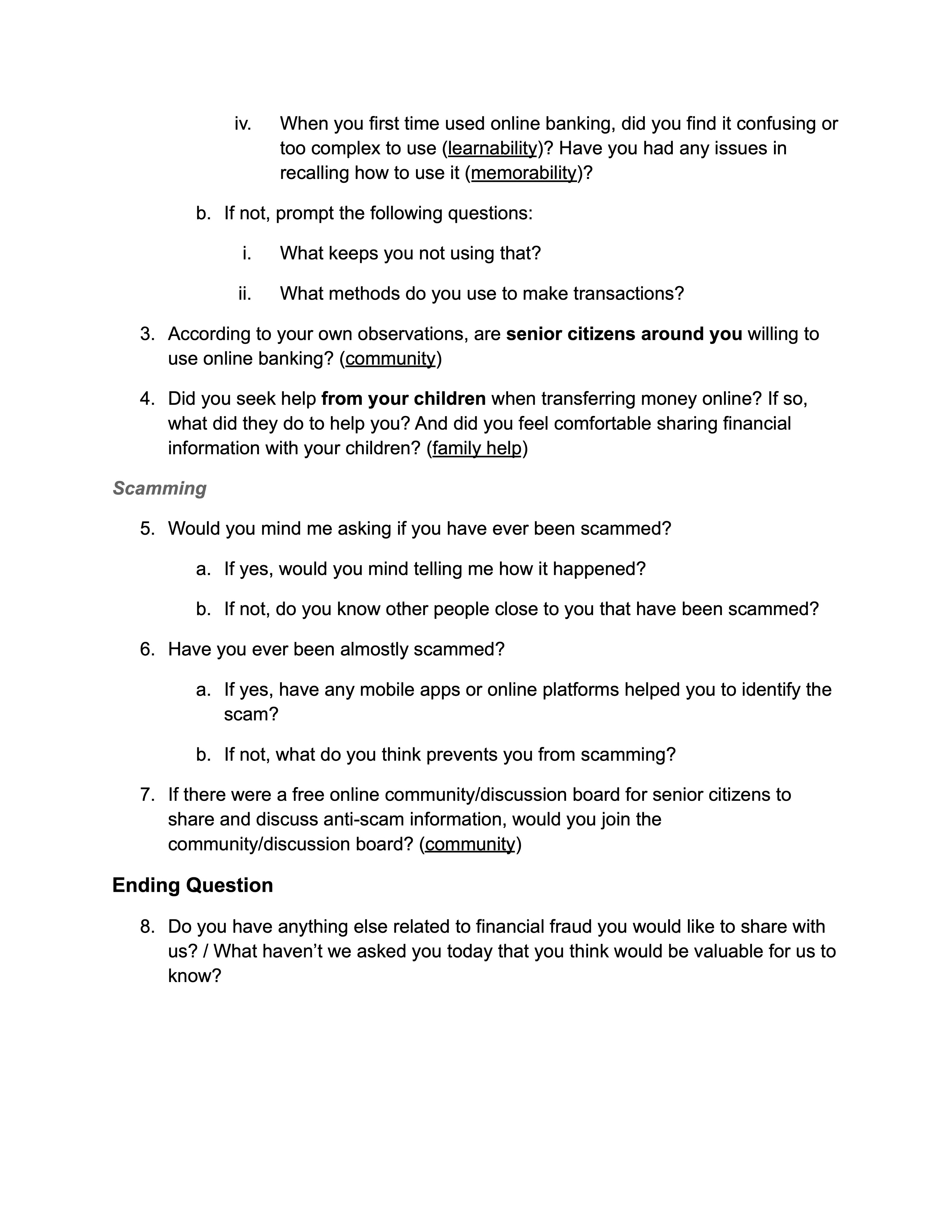
To better understand the needs of our users, senior citizens, and gain deeper insights into their requirements, we developed interview protocols and conducted interviews with four senior citizens.
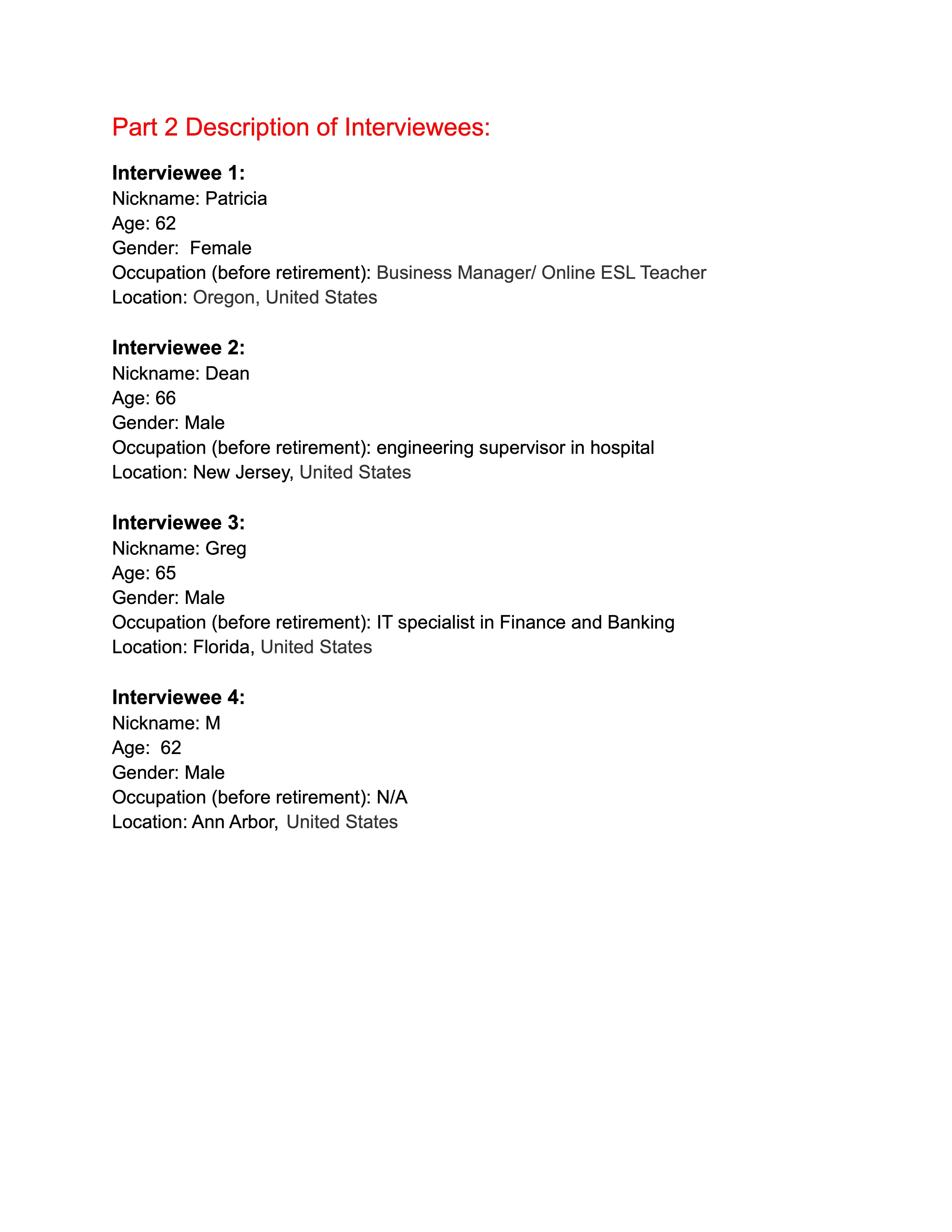
Interview Transcripts & Interviewee Information (Anonymized)
(Click pictures to view details)
Upon analyzing the four interviews, we identified four common themes.
Theme 1:
Theme 1:
Senior citizens require communication beyond software operation, particularly assistance from familiar individuals.
Theme 2:
Theme 2:
Significant differences exist in the use of online banking among senior citizens, which depend on factors beyond age.
Theme 3:
Theme 3:
Security measures for online transfers are present but insufficient.
Theme 4:
Theme 4:
Most interviewees or their relatives have experienced scams.
What we learned
to guide us through the next steps...
Refining our target user group
Recognizing the variations in online banking usage among senior citizens, we determined that designing a system to protect all of them from scams would be overly challenging. Additionally, we noted that the term "senior citizens" is ambiguous, as some interviewees felt they were too young to fall into this category, and age significantly impacts the ability to use online banking.
Consequently, we decided to refine our target user group in two ways:
Senior citizens who are familiar with and comfortable using new technology, such as smartphones and online banking apps.
Senior citizens aged 65 or older.
Emphasizing community and adding a one-click help function
Through these interviews, we discovered that senior citizens require more communication than initially anticipated. To facilitate safer and more effective usage of online transfer tools, our interactions should not be limited to a static mobile phone screen. As previously considered, we need to provide a community where seniors can communicate with one another.
Additionally, we plan to introduce a one-click "Ask for Help" button. Senior citizens can pre-set contact information for family members or trusted friends within our application. When transferring money, they are advised to communicate with these contacts before proceeding to the next step.
Enhancing visibility and efficiency of alerts and authentication tools:
We acknowledged that two-factor authentication is useful for protecting senior citizens from scams. However, the current user experience is suboptimal, and not all users, particularly seniors, may utilize it.
Our approach involves optimizing the user experience of these tools, integrating them more effectively with online banking applications, and incorporating additional alerts. These alerts can inform users of actions that are indicative of scams and flag accounts that have been involved in scams on multiple occasions.
1.4 Solution Formulated
Following our comprehensive user research, we intend to create a software solution or extension that alters the interaction logic for elderly individuals participating in "online transfers." This approach aims to ultimately reduce the probability of these individuals becoming victims of financial fraud.
Our “how might we” statement guiding our design is:
How can senior citizens aged 65 or older, who are familiar with smartphones, safely use online transactions without being scammed?
Four essential components our solution must support to address the problem:
(1) Prominent alerts for senior citizens, activated in response to suspicious transactions
(2) Features that allow family members of senior citizens to help monitor questionable transactions
(3) An easily accessible anti-scam online community tailored to senior citizens
(4) A highly readable and intuitive interface and interaction within the app, specifically designed for senior citizens
Step 2: Function Design
2.1 Persona & Scenario
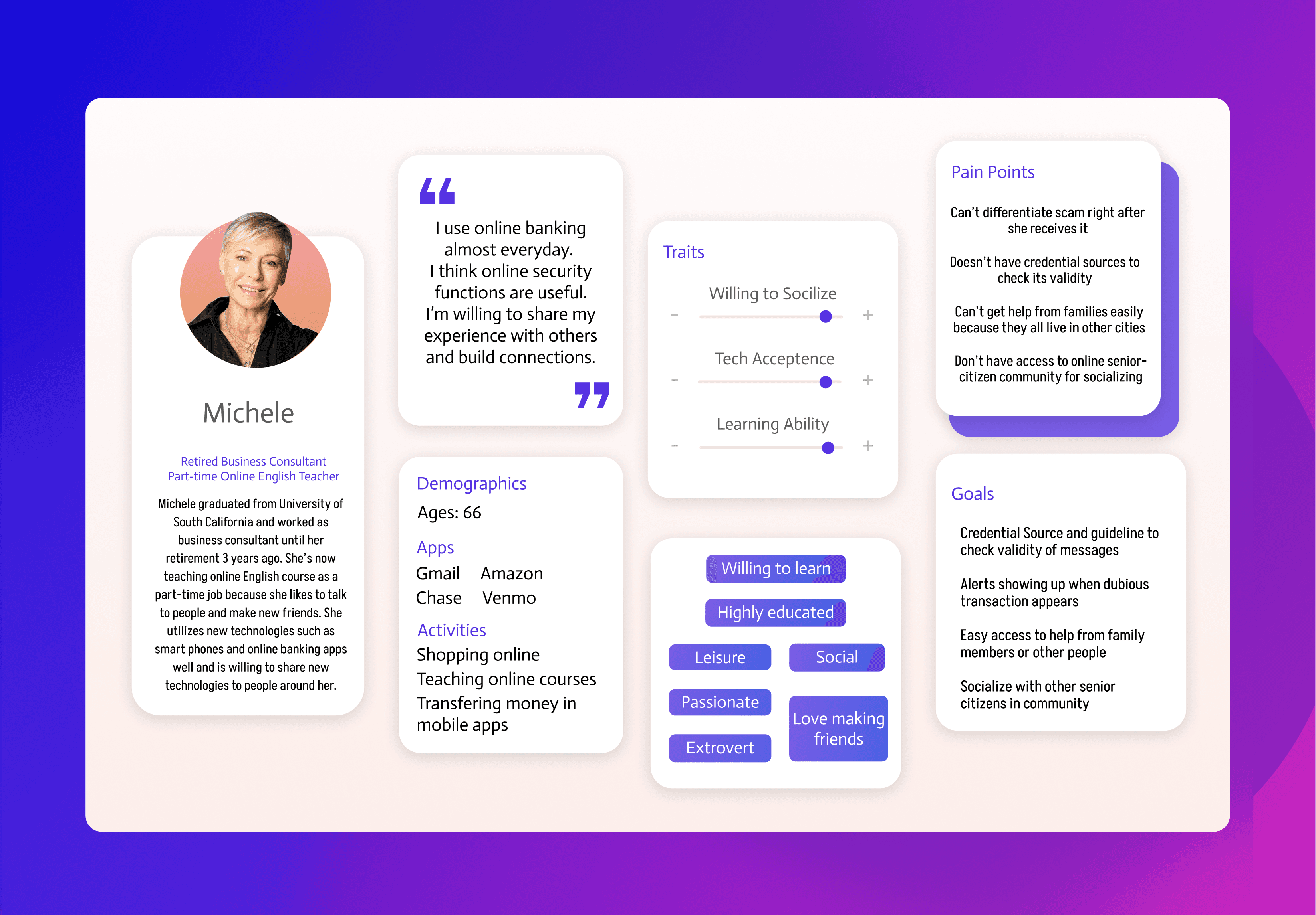
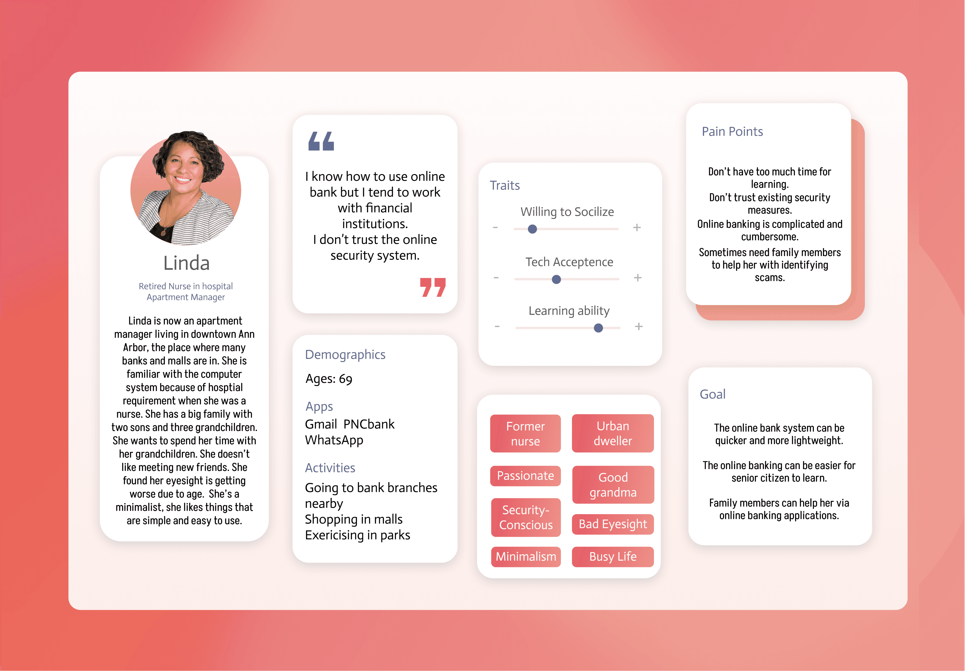
Drawing from our interviews, we have developed two personas and corresponding scenarios to inform and inspire our design process.
(Click pictures to see details)
Drawing from our interviews, we have developed two personas and corresponding scenarios to inform and inspire our design process.
(Click pictures to see details)
Primary Persona: Open-to-Tech & Outgoing
Secondary: Neutral-to-Tech & Family-oriented
2.2 Function & Storyboard
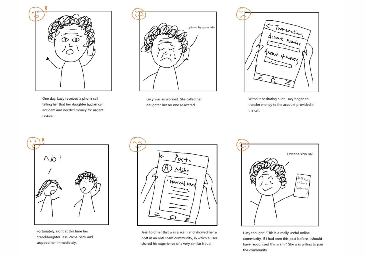
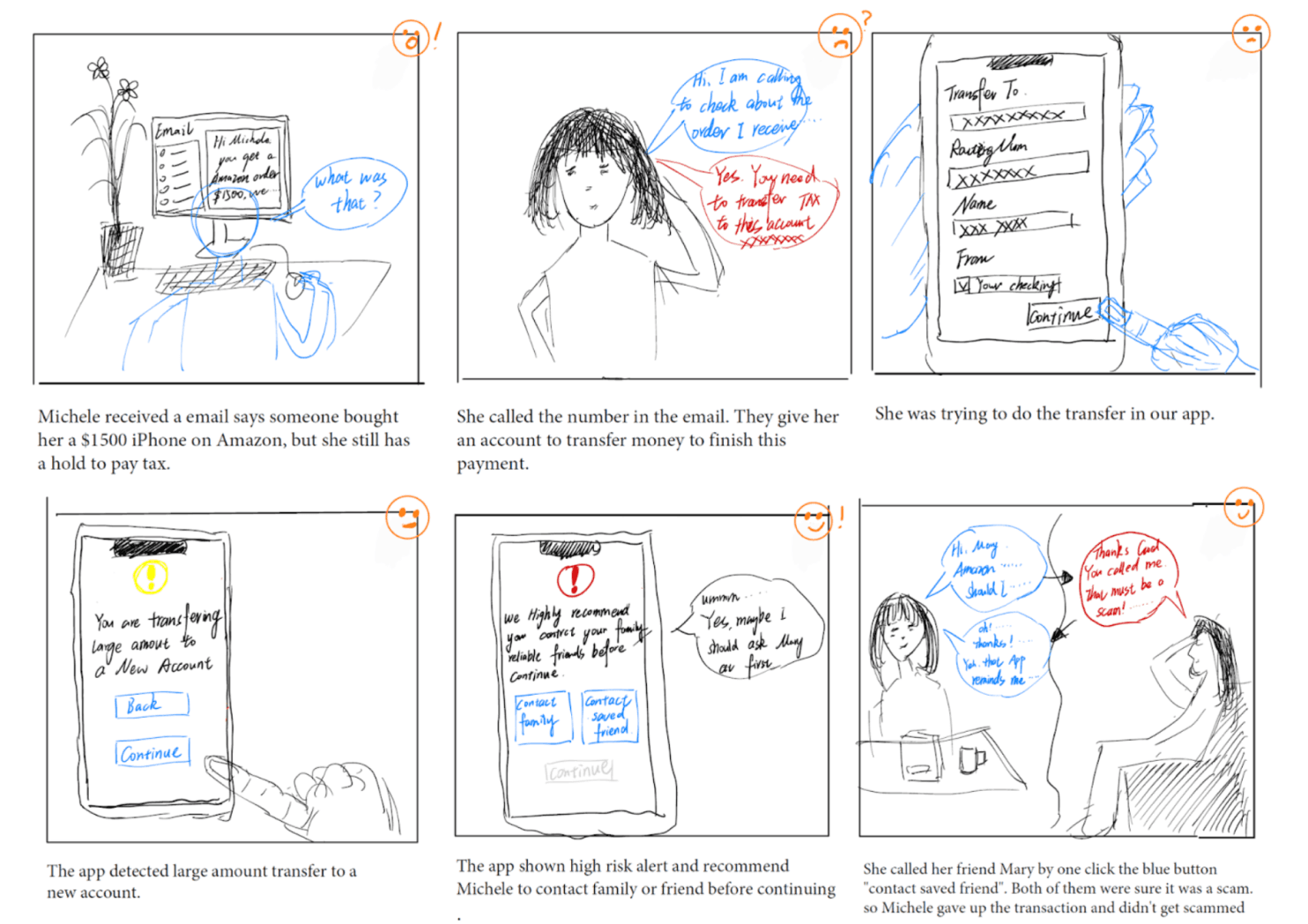
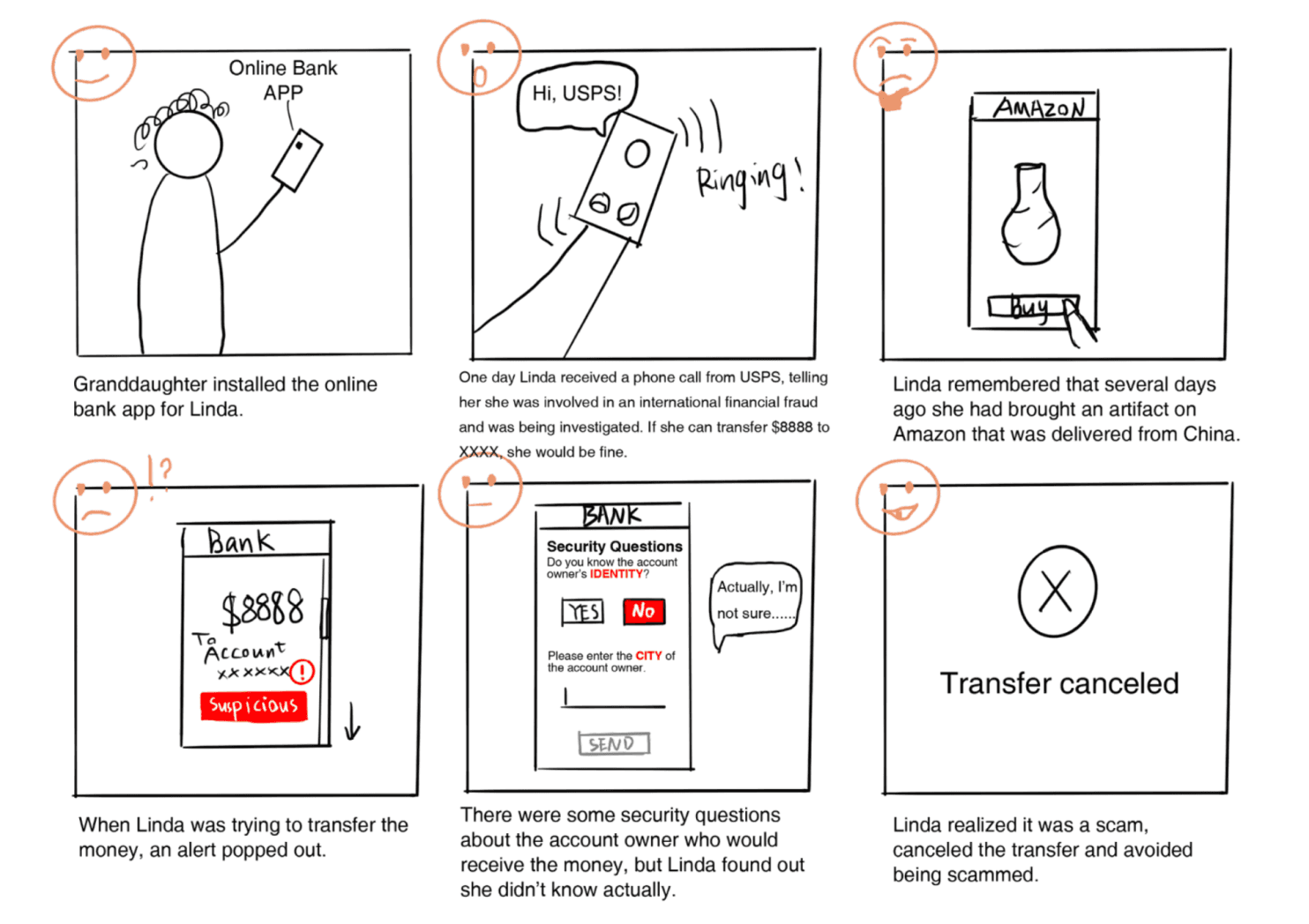
Upon completing our UX research and developing personas and scenarios, we have identified the three primary functions of our app. We have created storyboards to effectively convey the user experience and the context in which these functions will be utilized.
Function 1. Transaction
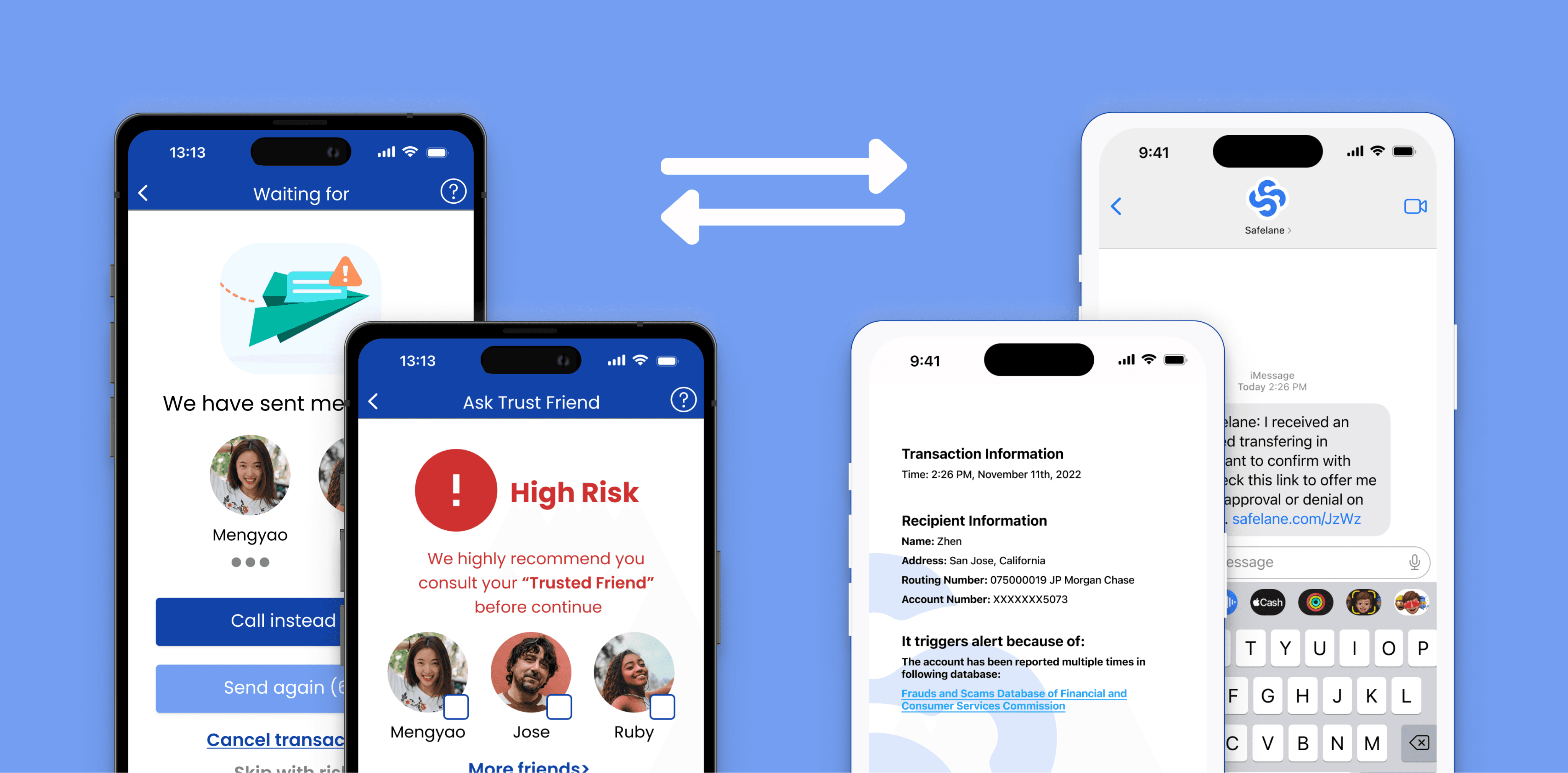
Users have the option to conduct in-app transactions and wire transfers based on their needs. Upon entering the recipient's information, if the recipient's account is identified as suspicious, the user will receive a high-risk alert accompanied by a security question. At this point, the user can choose to proceed with the transaction, cancel it, or contact their trusted friends.
Function 2. Community
The online community within Safelane serves as a platform for users to share their experiences with financial scams and seek assistance from others. Safelane will also create official posts to disseminate anti-scam knowledge and real-world cases.
Function 3. Credit & Coupon
Users can view the credits they have earned on their Profile page. They can filter through all available merchants and redeem the coupons they desire. Our goal is to encourage users to integrate Safelane into their daily lives.
Storyboard
Storyboard
The three storyboards each represents (1) function “Community” (2) one-click consult friends of function transaction (3) pop-up alert of function transaction
2.3 User Flow
2.3 User Flow
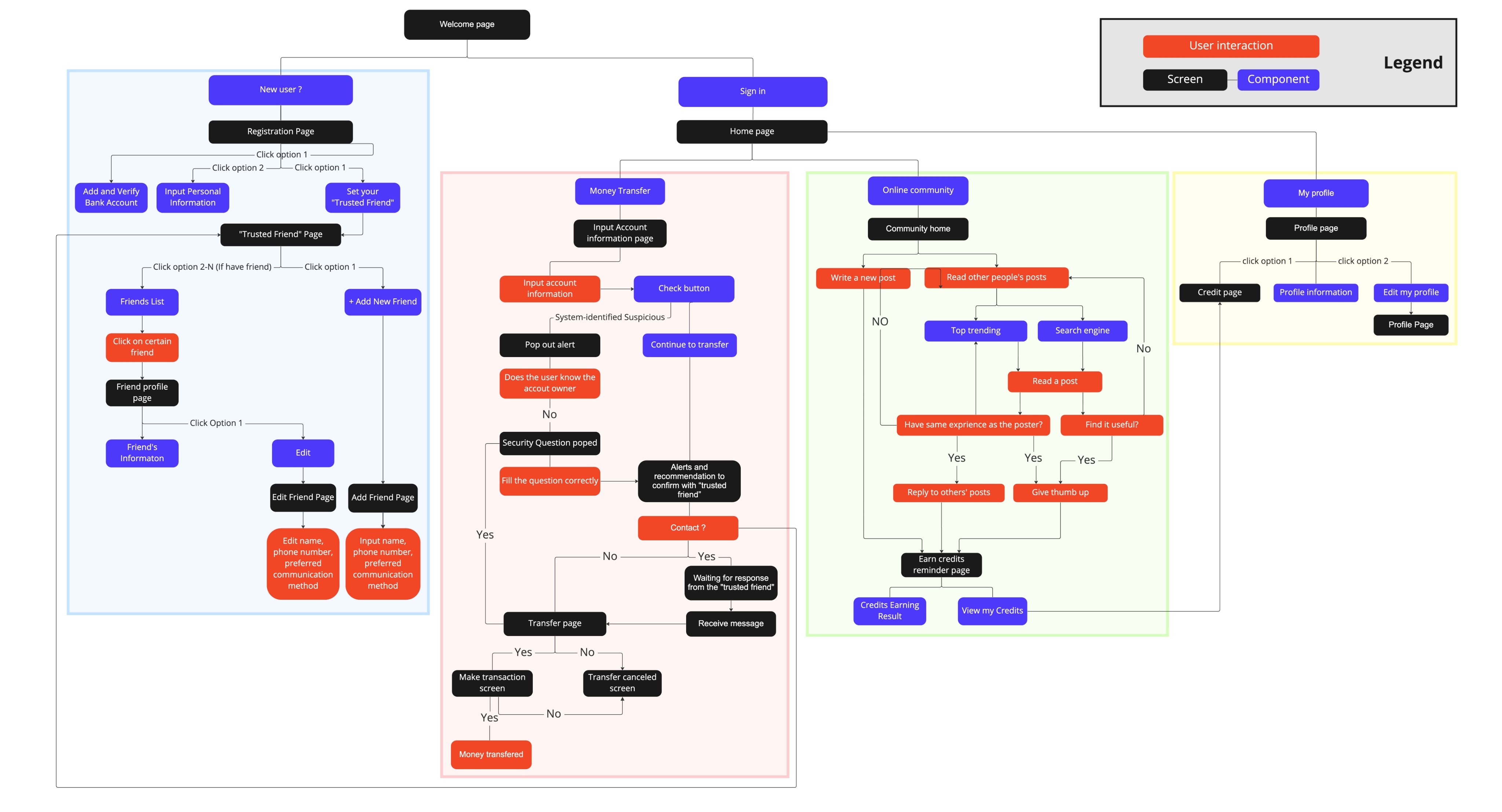
In preparation for creating the actual design, we developed a user flow to effectively visualize and comprehend the various steps and interactions users will encounter while using our app.
The chart presents the initial user flow of Safelane, with distinct colors assigned to squares representing the four primary pages within the app. This visual representation helps to organize and delineate the app's core components during the early stages of design.
Step 3: Design Iterations & Testing
3.1 Paper Prototype
3.1 Paper Prototype
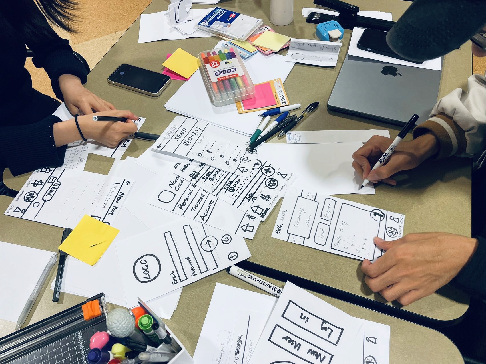
In initial stage of design process, we utilized paper prototypes to quickly explore and validate design concepts. This approach allowed us to iterate on ideas efficiently, gather user feedback, and identify potential issues or areas for enhancement before moving forward with more refined prototypes and development.
The picture shows our working time for paper prototype.
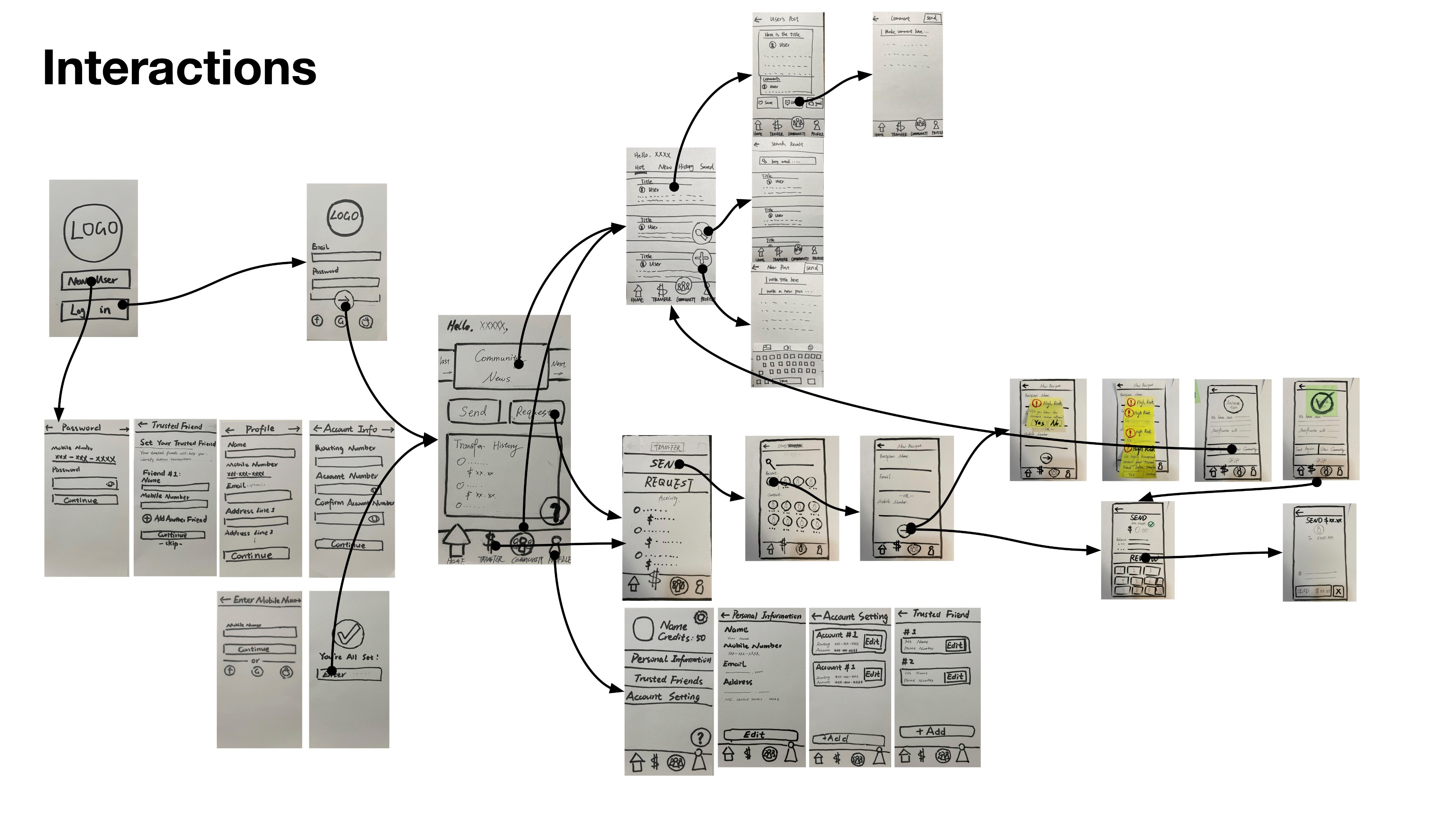
The chart presents the paper prototype we drew. The arrows show the interaction processes, and colorful stickers show the pop-up items.
3.2 Wireframe
3.2 Wireframe
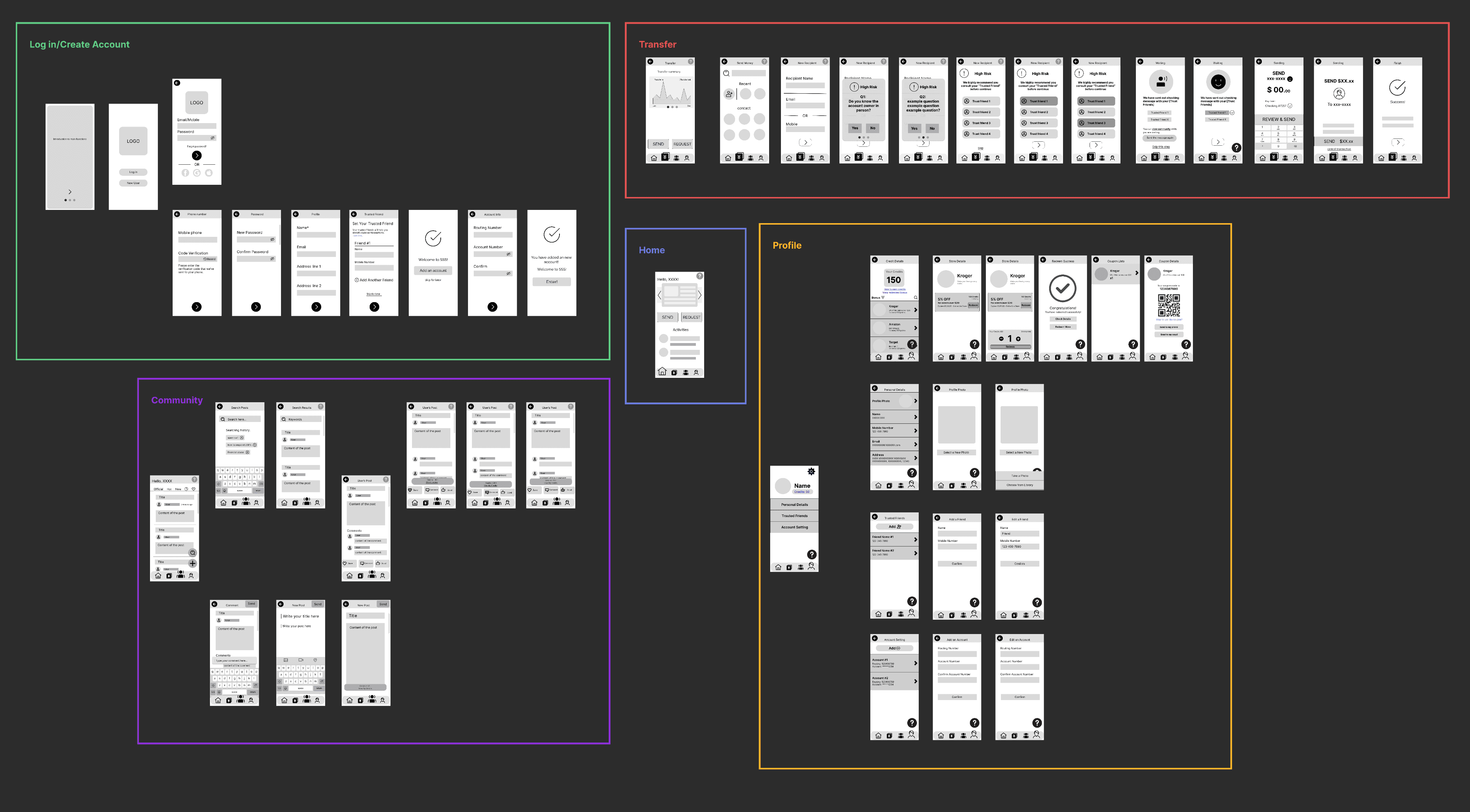
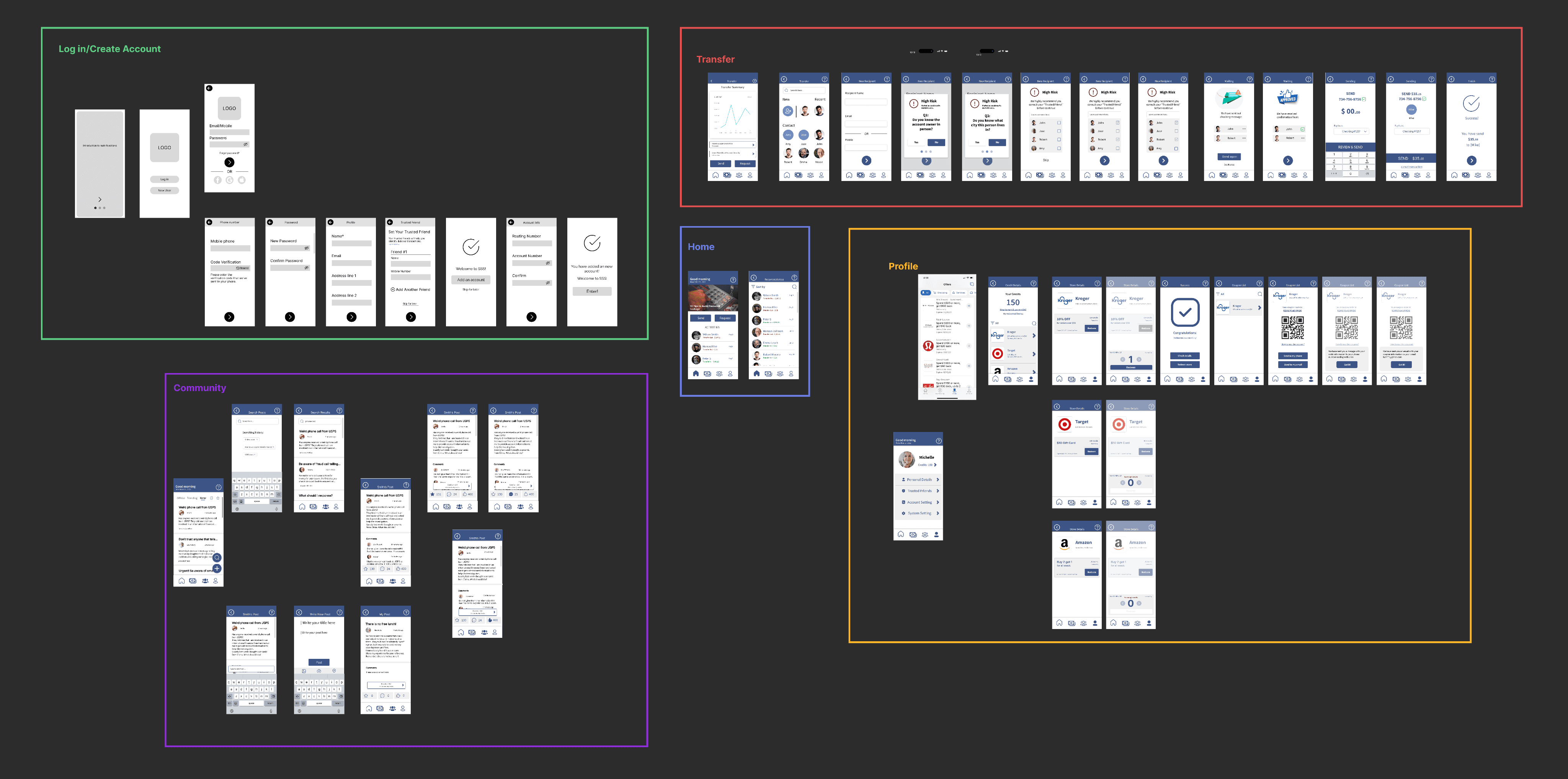
We created wireframes based on our paper prototype to establish the foundational structure and layout of the user interface. This step allowed us to visually organize key elements, ensure consistent design patterns, and facilitate clear communication among team members. Wireframes enabled us to refine the user experience with user testing before moving forward with more detailed prototypes and development.
The chart presents the wireframe we created for Safelane, with distinct colors assigned to squares representing the five primary pages within the app.
3.2.1 Wireframe Heuristic Evaluation & Usability Test
To identify usability issues in the early stages of design, we conducted heuristic evaluations using Nielsen's Heuristic Evaluation principles and performed five wireframe usability tests with users. This approach allowed us to address potential concerns and enhance the user experience before progressing to more advanced stages of development.
Tasks Referred in Heuristic Evaluation & Usability Tests
Task 1
Task 1
Task 1
Welcome and Transfer
—> Start from homepage
—> Sending money to a new account
—> Ask for help from trusted friend if encountering alert
—> See the results, and confirm sending if trusted friend approves
—> Start from homepage
—> Sending money to a new account
—> Ask for help from trusted friend if encountering alert
—> See the results, and confirm sending if trusted friend approves
Task 2
Task 2
Task 2
Community and Credit
—> Go to Community page and Make a New Post
—> Return to community main page, search article, choose an article, and give a thumb to it
—> Go to the credit page, and redeem a coupon of Kroger
—> Go to Community page and Make a New Post
—> Return to community main page, search article, choose an article, and give a thumb to it
—> Go to the credit page, and redeem a coupon of Kroger
Task 3
Task 3
Task 3
Locate Features
Locate Features
Locate Features
(Try to throw users at the home page and let them find how to do the following)
—> Edit information of one of trusted friends.
—> Check how many credits they have
(Try to throw users at the home page and let them find how to do the following)
—> Edit information of one of trusted friends.
—> Check how many credits they have
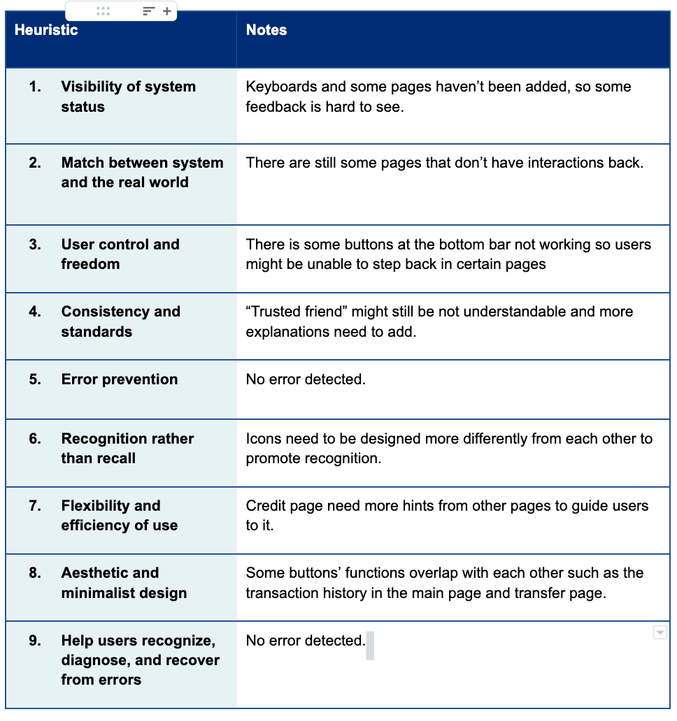
The chart presents the heuristic evaluation sheet I finished according to Nielson’s Heuristic Evaluation Principles. We each finished one and integrate together as one version for future reference for improvement.
The pictures show one wireframe usability test I did for Safelane.
What we learned
to guide us through the next steps...
Log in/Create an Account:
The primary concern for the Log in/Create an Account page was determining the necessary information to be collected during new user registration. Additionally, we needed to consider which sections of the Homepage should be emphasized to capture users' attention.
Transfer:
The most significant challenge for this part of the page was striking a balance between functionality and complexity. During usability testing, some participants noted that the security measures seemed cumbersome, indicating that this issue needed to be addressed in the next stage of development.
Community:
The main concerns regarding the online community centered around its feasibility and user-friendliness, requiring further evaluation and refinement.
3.3 Lo-Fi Prototype
3.3 Lo-Fi Prototype
We developed a low-fidelity (lo-fi) prototype based on our wireframes to offer a higher level of fidelity for testing and to serve as an intermediary iteration between the wireframes and high-fidelity (hi-fi) prototypes. This stage allowed us to further explore and organize visual elements while collecting additional feedback from users during subsequent usability tests.
The chart presents the Lo-Fi prototype we created for Safelane, with distinct colors assigned to squares representing the five primary pages within the app. Lo-Fi of “Log-in and Create Account” pages was not updated in this chart.
3.3.1 Lo-Fi Prototype Usability Test
To further identify usability issues, we performed five Lo-Fi usability tests with users using the tasks as Wireframe Prototype Usability Test
What we learned
to guide us through the next steps...
Font Size Standardization
We need to establish a standardized set of guidelines or more specific rules for font sizes. Although we initially attempted to use a consistent set of font sizes for various text content in our pages, we discovered that certain sizes were not suitable for our design elements and were not easily legible.
Official Posts Display
Concerning the Online Community, we still need to determine the most effective display method for the Official Posts page. We anticipate that official posts will primarily utilize photos and short videos, rather than lengthy text, to engage senior citizens more effectively and convey anti-scam knowledge in a more accessible manner.
Security Question Logic:
Further refinements to the security question process are necessary. We have not yet finalized the exact content of the three security questions or the logic governing their flow. For instance, should we guide users to contact trusted friends only if they answer "no" to all three questions? If a user responds "yes" to the first question, should we bypass the remaining two questions and direct the user to proceed with the transaction?
3.3.2 UI Design
3.3.2 UI Design
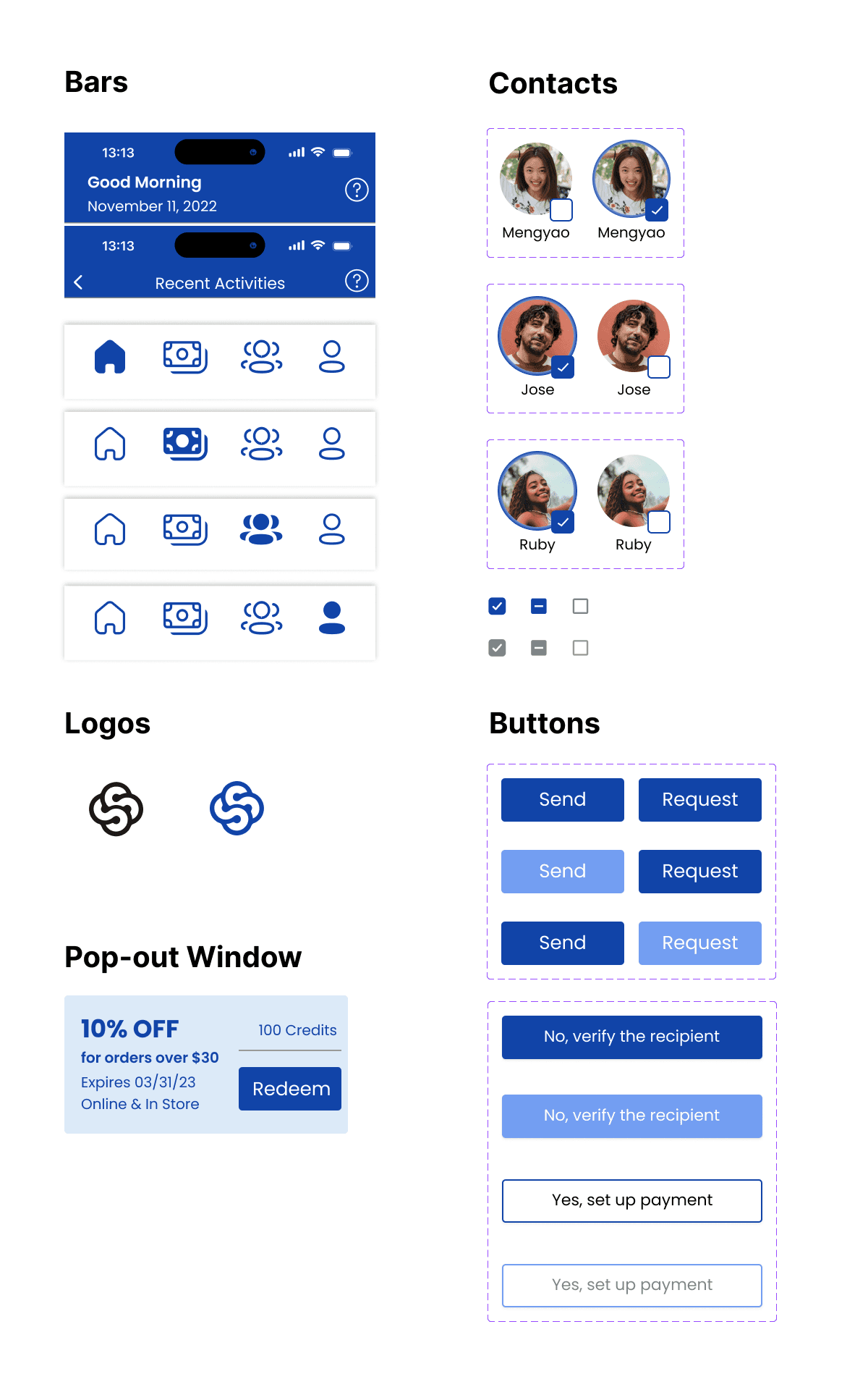
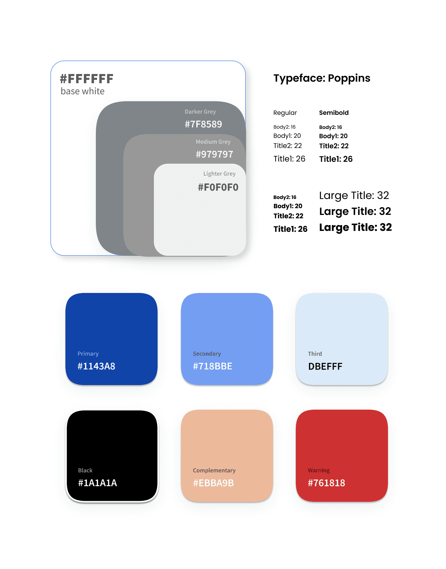
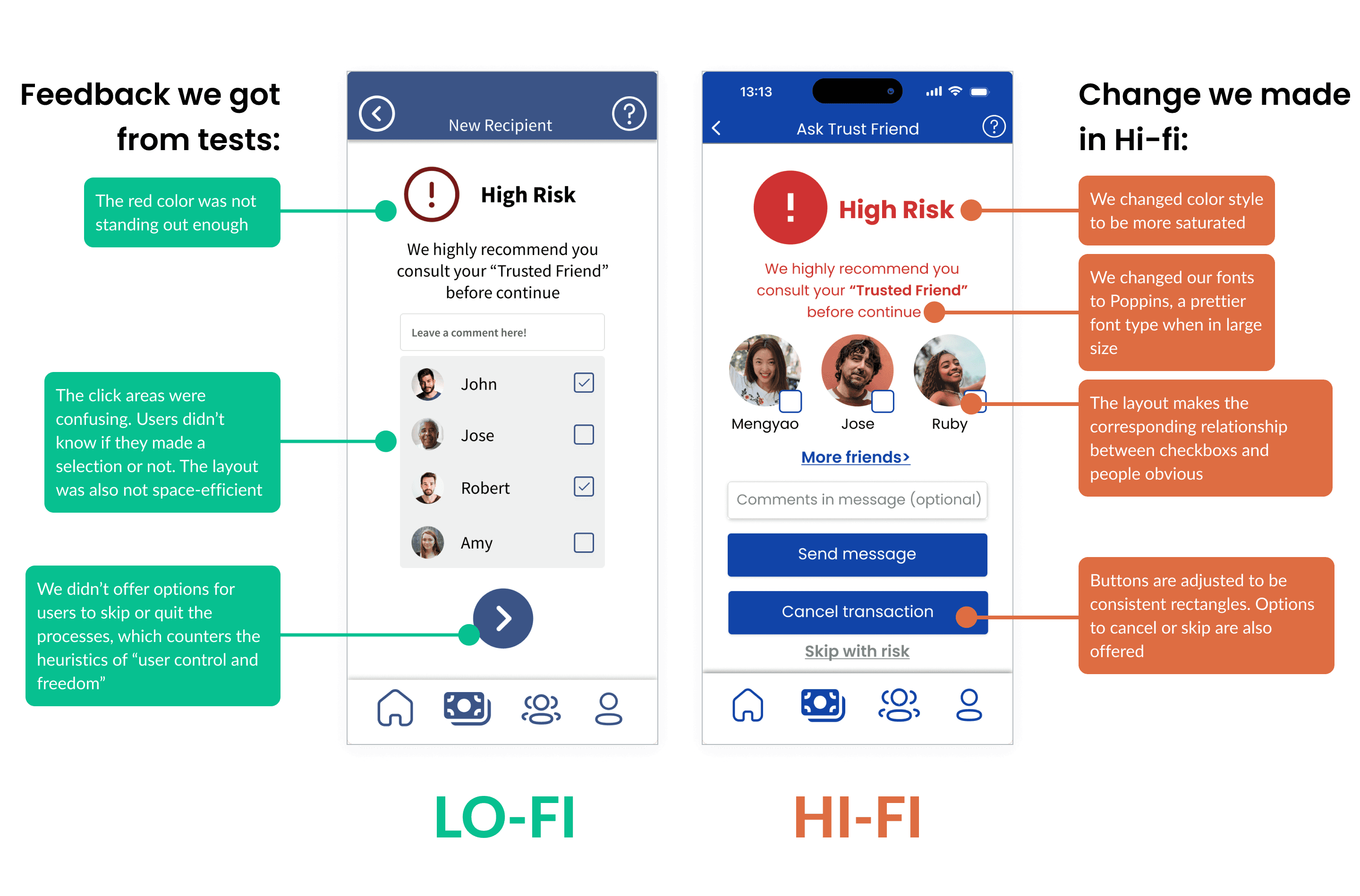
Based on the insights gained from our low-fidelity prototype usability tests, we advanced from the low-fidelity prototype to a high-fidelity prototype by refining the UI design. This progression allowed us to concentrate on visual aspects such as colors, typography, and iconography, ensuring a polished and aesthetically pleasing interface.
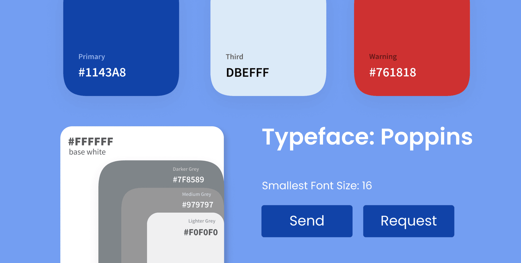
In this section, I will showcase our style guide, which includes color and typography, components, and a comparison of an interface from low-fidelity to high-fidelity, highlighting the improvements we made.
Components
Components
Style Guide
Style Guide
The chart presents the initial user flow of Safelane, with distinct colors assigned to squares representing the four primary pages within the app. This visual representation helps to organize and delineate the app's core components during the early stages of design.
3.3.3 UX Design
3.3.3 UX Design
Based on the insights gained from our heuristic evaluation and usability tests, we reviewed and revised our UX flow in our main user function. Here are some major examples.
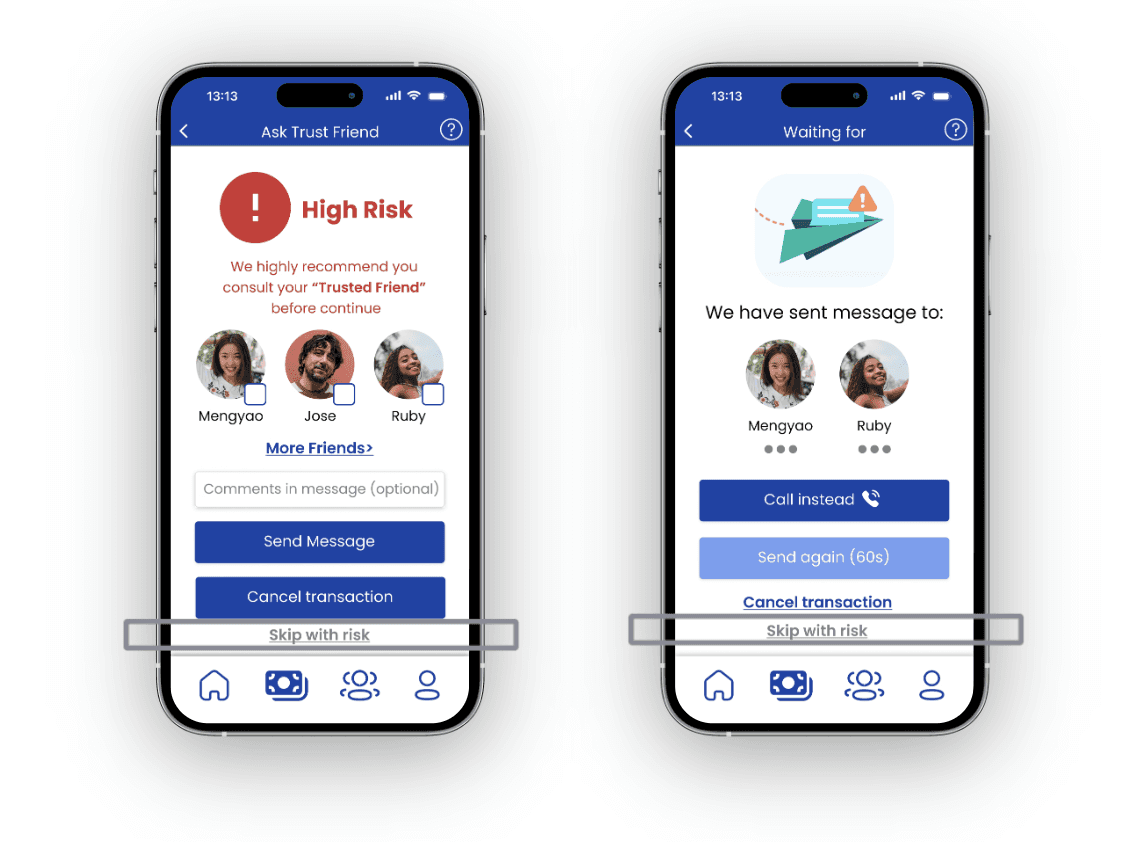
User Control & Freedom
Allow users to skip in every step of the process while making strong guidance to contact trusted friends.
User C: "I would feel offended if you force me to contact my children. You presume that I'm too old to complete the task on my own."
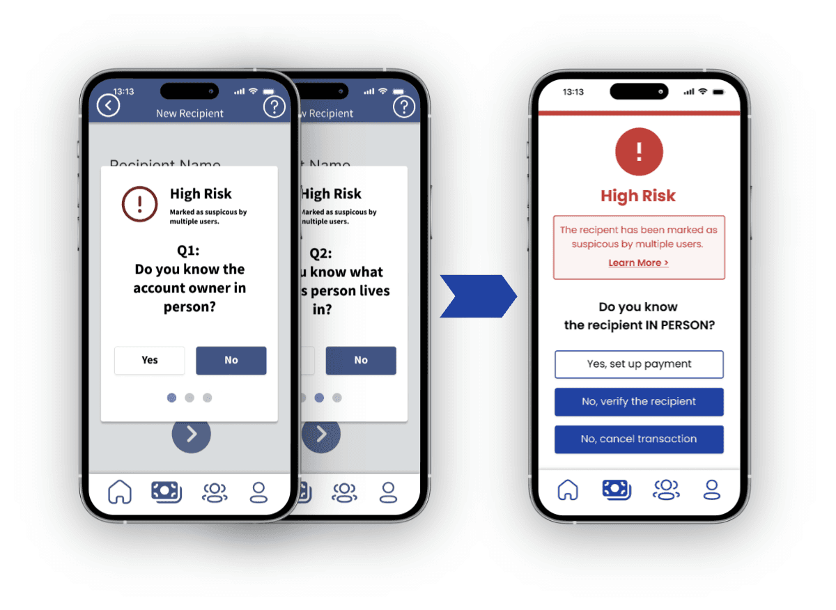
Simplicity vs. Complexity
To make strong alerts without overburdening users, we put only the most straightforward one security question instead of three.
User H: "The security check was very long and complex. I would lose my patience if I actually use the app for transfer."
3.4 Hi-Fi Prototype
3.4 Hi-Fi Prototype
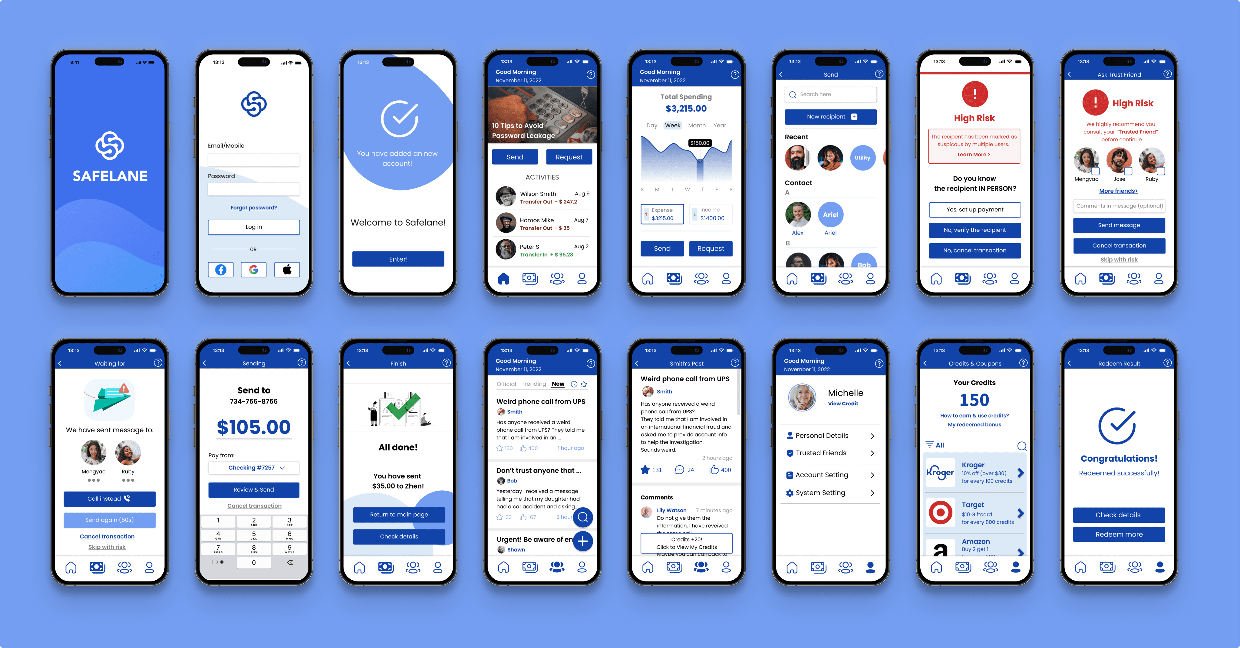
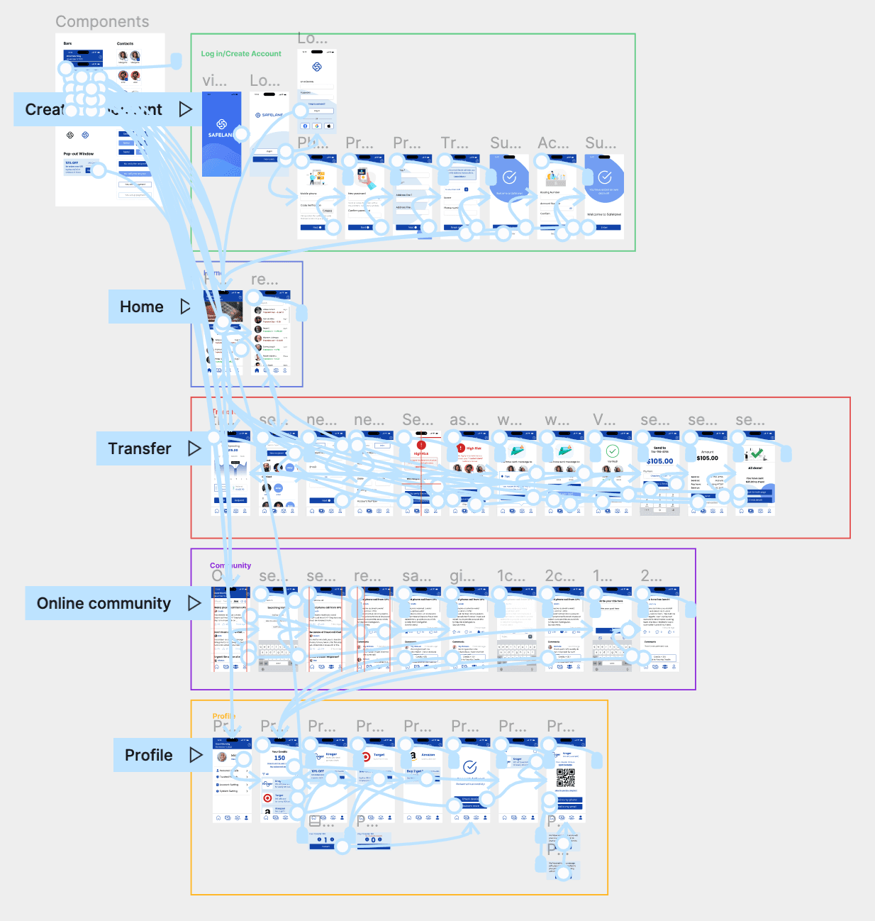
Following a series of design iterations and testing, we have ultimately created the final high-fidelity prototype for Safelane.
The chart presents the Hi-Fi prototype we created for Safelane, with distinct colors assigned to squares representing the five primary pages within the app and interactions between interfaces.
Reflection
Reflection
Functionality Balance
During the design of our app, we ensured a balance between the effectiveness of our alerts and allowing users the freedom to make their own choices. With the "Ask Trusted Friend" function, we experimented with various approaches to find the right balance. However, we remain uncertain if there is room for improvement in terms of functionality and user satisfaction.
Limited Interaction with Target Users
Regrettably, due to time and resource constraints, we could only conduct interviews with our target users during the research and design process. We were unable to perform usability testing with these users. It would have been more beneficial if we had provided our target users the opportunity to use our app and offer valuable feedback.